Understanding your audience is about knowing who your visitors are, where they’re coming from, and what’s attracting new and returning guests. It’s crucial to have clarity around who’s walking through your gates — and who’s not…yet!
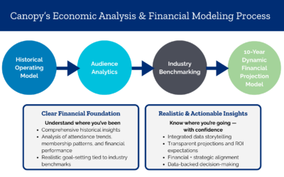
At Canopy, our driving philosophy is that there is no mission without margin, which means that strategic visions and decisions should always be informed by economics. We use a multitude of data to identify changes that can help you grow sustainably, and we show the impact those changes will have in your organization and throughout the region you serve.
With the right tools and expertise, you can not only analyze your current audience’s habits but also uncover any untapped visitation potential beyond your admissions entrance.
Let’s dig a little deeper into Canopy’s signature tools and approach with our Market Analyst, Sydney Williams.
Placing the Audience
Traditional sources like census data can tell you income, race, or household size in broad strokes. But we use a location-based analytics platform to go deeper, aggregating anonymized cell phone location data to reveal audience behaviors in incredible detail.
By geofencing cultural attractions, we can identify who’s actually showing up — whether they live locally or traveled across the country. It also provides drive-time breakdowns (30, 60, and 90 minutes) to show how visitor profiles shift with distance.
Our audience analytics platform is unique in that it can aggregate demographics beyond race and income, allowing us to look at factors like household size, ancestry, and even visitor job industries. The real value comes from comparing captured vs. potential markets: who you’re reaching today and who you’re missing. That crucial knowledge can inform pricing, marketing strategies, and programming decisions.
“Part of the story is saying, ‘This is who’s not showing up — and this is who you can reach.’ That way, we can help clients shape strategies to keep their current visitors while also expanding to new audiences.”
Mapping the Story
The process of mapping comes next: Using ArcGIS, we layer trade area profiles and drive-time boundaries over visitor data to create visualizations that our clients can interact with to better understand their communities.
How it works:
Far more powerful than a spreadsheet, mapping starts with drive-time radials; within those boundaries, we can plot visitor origins. This immediately shows who lives within easy reach and who is traveling from farther away.
“As soon as you look at the map, you can see: These folks are local, these are tourists, and these are from much farther afield.”
We then layer on the U.S. freeway system to reveal accessibility and barriers. For example: One of our clients, Ellen Trout Zoo, is tucked away from major highways in rural Texas, making the attraction more reliant on nearby visitors. In contrast, Jacksonville Zoo and Botanical Gardens (another client) sits directly on travel routes to Orlando and South Florida, meaning nearly every passing car represents potential visitation.
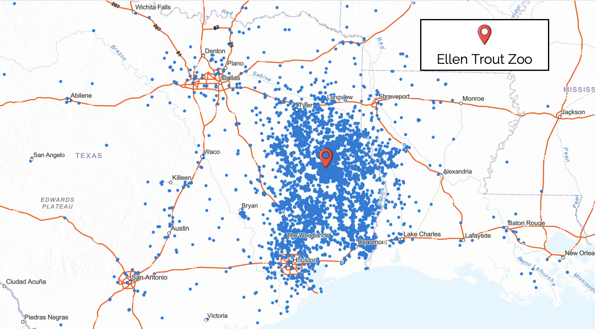
Ellen Trout Zoo: U.S. highway map. The blue dots represent visitor origins and the orange lines show the freeway system.
Another layer on the map shows visits by radial, shading areas from highest to lowest density. Finally, the demographics layer adds household income and race/ethnicity data directly onto the map. It shades neighborhoods from purple to green for income, and different colors for race and ethnicity. You can see overlap (or lack thereof) at a glance.
Together, all these layers create a rich picture of who’s coming, who isn’t, and where opportunities lie.
“The map helps build a story. It shows the numbers AND the context — the neighborhoods, the access points, the socioeconomic realities.”
Turning Data Insights Into Strategy
Once we build this layered picture of your audience, we can help pinpoint strategic growth opportunities. That’s where the expert lenses of our Economics and Planning teams — combined with years of historical knowledge from working with hundreds of mission-driven institutions — really come into play.
Sometimes the insights back up what’s happening financially. We use audience analytics to truly understand what we’re seeing in membership capture rates and admissions pricing.
“If you’re capturing lots of visitors from a particular income bracket, your pricing is probably aligned. But if you’re missing whole neighborhoods — especially lower-income households — it could be price sensitivity or accessibility.”

Jacksonville Zoo and Botanical Gardens: On this map, you can see the median household income in the surrounding region shaded from purple (<35,000) to dark green (>114,800). The red lines show the U.S. freeway system.
For example, visitors earning $35,000/year may face higher barriers: ticket costs, travel distance/transportation, or the trade-offs of daily life. It’s not that organizations are intentionally excluding those visitors, but analytics can help you see the gaps clearly and connect them to decisions about pricing, membership, and access to your site.
Mapping can guide strategic choices: If you have high local visitation, should you invest in becoming a tourist draw or double down on your current market? Here’s a great example from one of our current clients, Anne Springs Close Greenway…
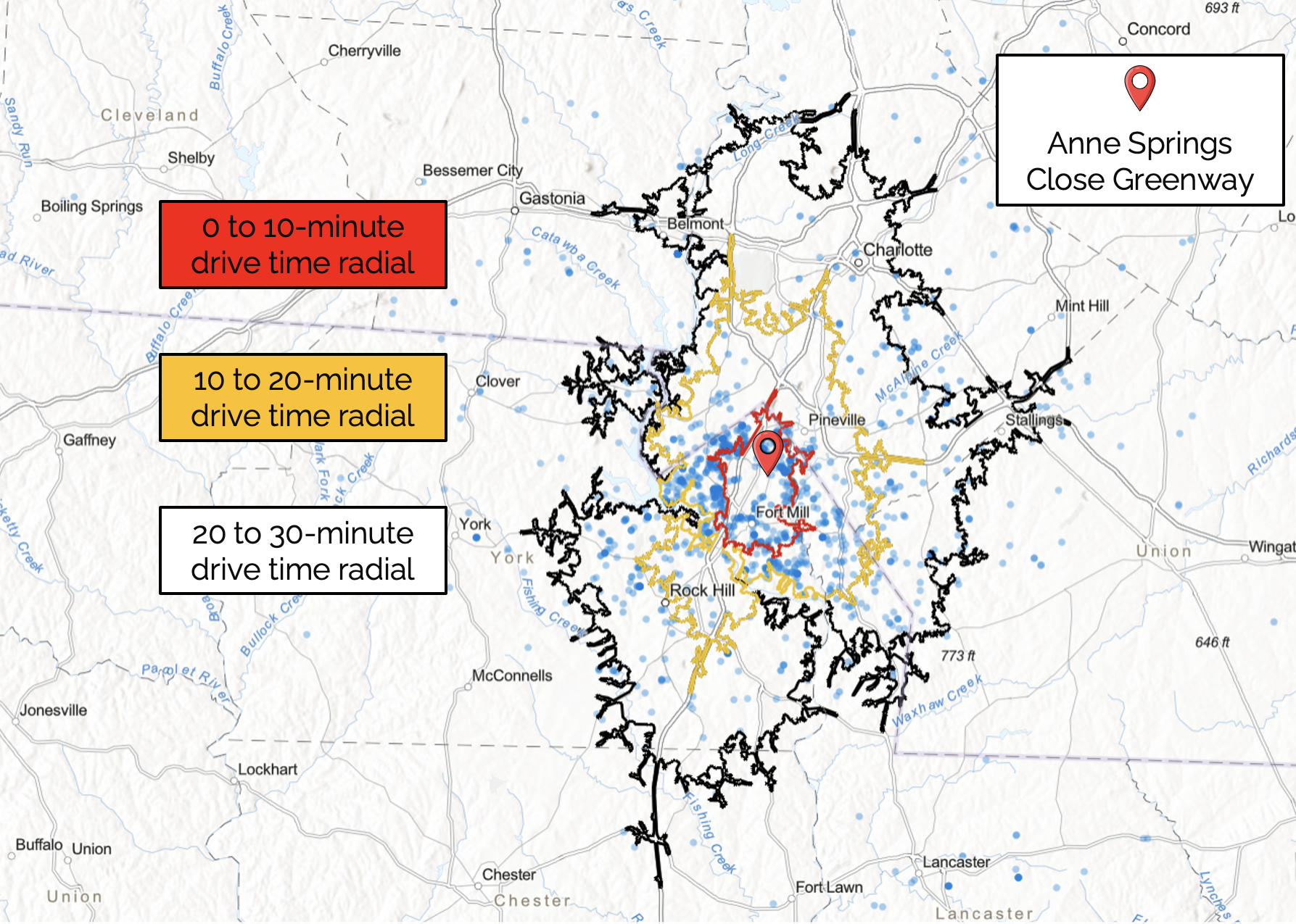
Anne Springs Close Greenway: Map of drive-time radials. Red = 0-10 mins. Yellow = 10-20 mins. Black = 20-30 mins.
Committing to Community and Conservation
Located just outside Charlotte, North Carolina, Anne Springs Close Greenway is a 2,100-acre preserve held in trust to remain green in perpetuity — an oasis as development rises rapidly around Fort Mill, South Carolina.
During the Discovery phase of our strategic planning process, the Greenway team confronted a pivotal question: Should they prioritize expanding their reach into the broader Charlotte market, or deepening relationships with their members and growing local community? Audience analytics revealed both were viable options — yet each carried trade-offs between increasing attendance and conserving the land.
After reviewing the data and discussing mission alignment, the team was confident in their decision to focus on quality over quantity: prioritizing members and investing in community relationships rather than one-time visits from further afield. This strategic path is backed by the data, but it is also the path that best aligns with the Greenway’s heritage, identity, and long-term commitment to protecting their site.
That clarity has guided every subsequent goal as they continue to work on their 5-year plan — a model for how organizations can balance mission and margin by grounding decisions in both data and identity.
Aligning Mission and Margin
As evidenced by the above case study, audience analytics is more than a research exercise — it’s a decision-making tool. Our analytics platform does the heavy lifting of gathering demographic, geographic, and behavioral data. Mapping turns that information into a story you can visualize and interact with. And our team’s expertise helps cultural organizations make decisions with confidence: whether adjusting pricing and membership tactics, expanding marketing and programming, or rethinking visitor engagement.
There is no mission without margin. Many cultural attractions create strategic plans that contain a bold mission, vision, and goals — and those plans sit on a shelf, collecting dust, because they aren’t grounded in reality. Aligning the dream with the data is crucial. That’s why integrated, data-driven planning is so important — so that you can design strategies to keep your gates open and your communities engaged for many years to come.
Sydney Williams is a dynamic analyst and data storyteller with expertise in research, strategy, and translating complex data into actionable insights. Learn more about our Economics services here.